Multi-Media Photography
Perception
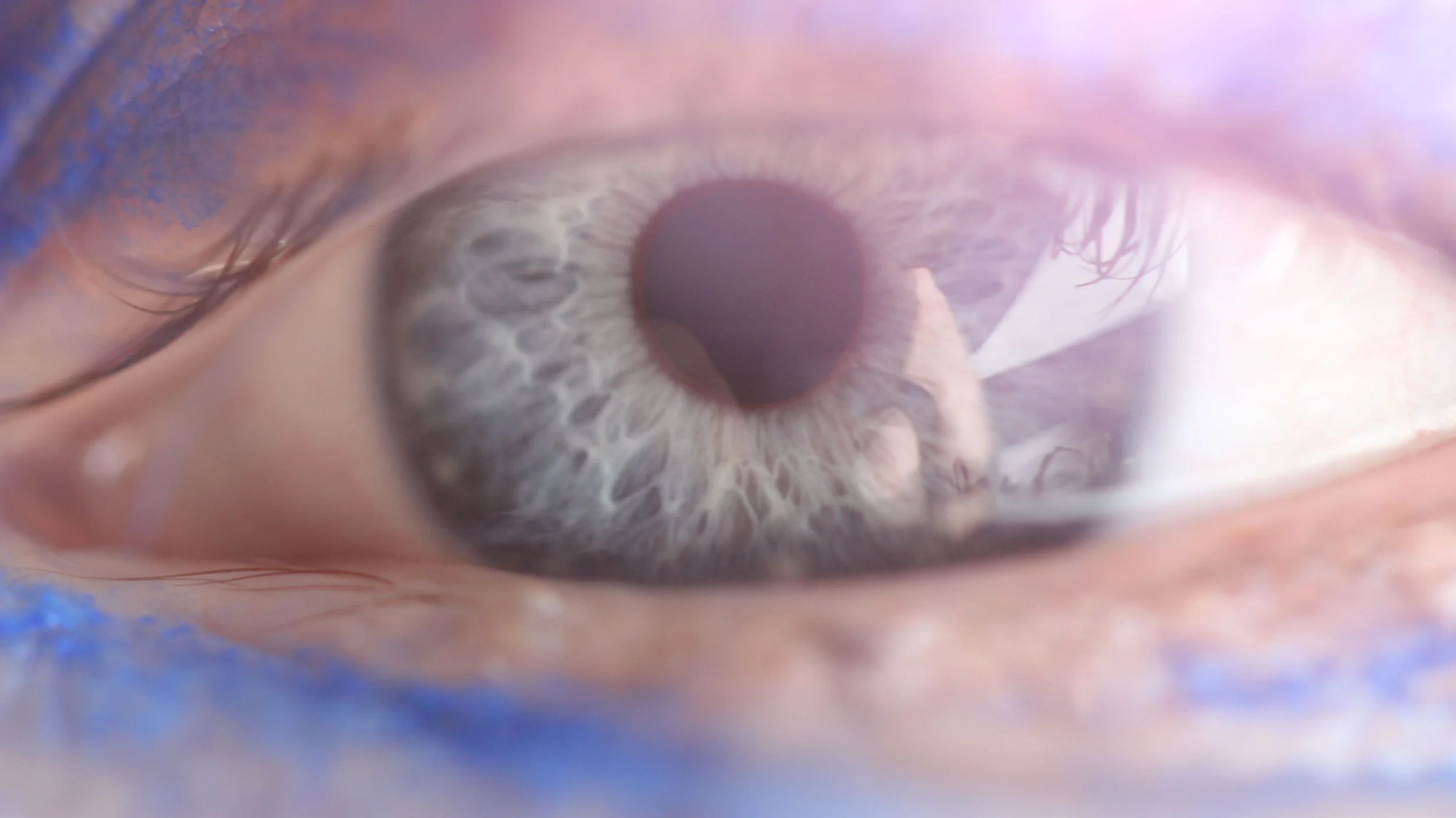
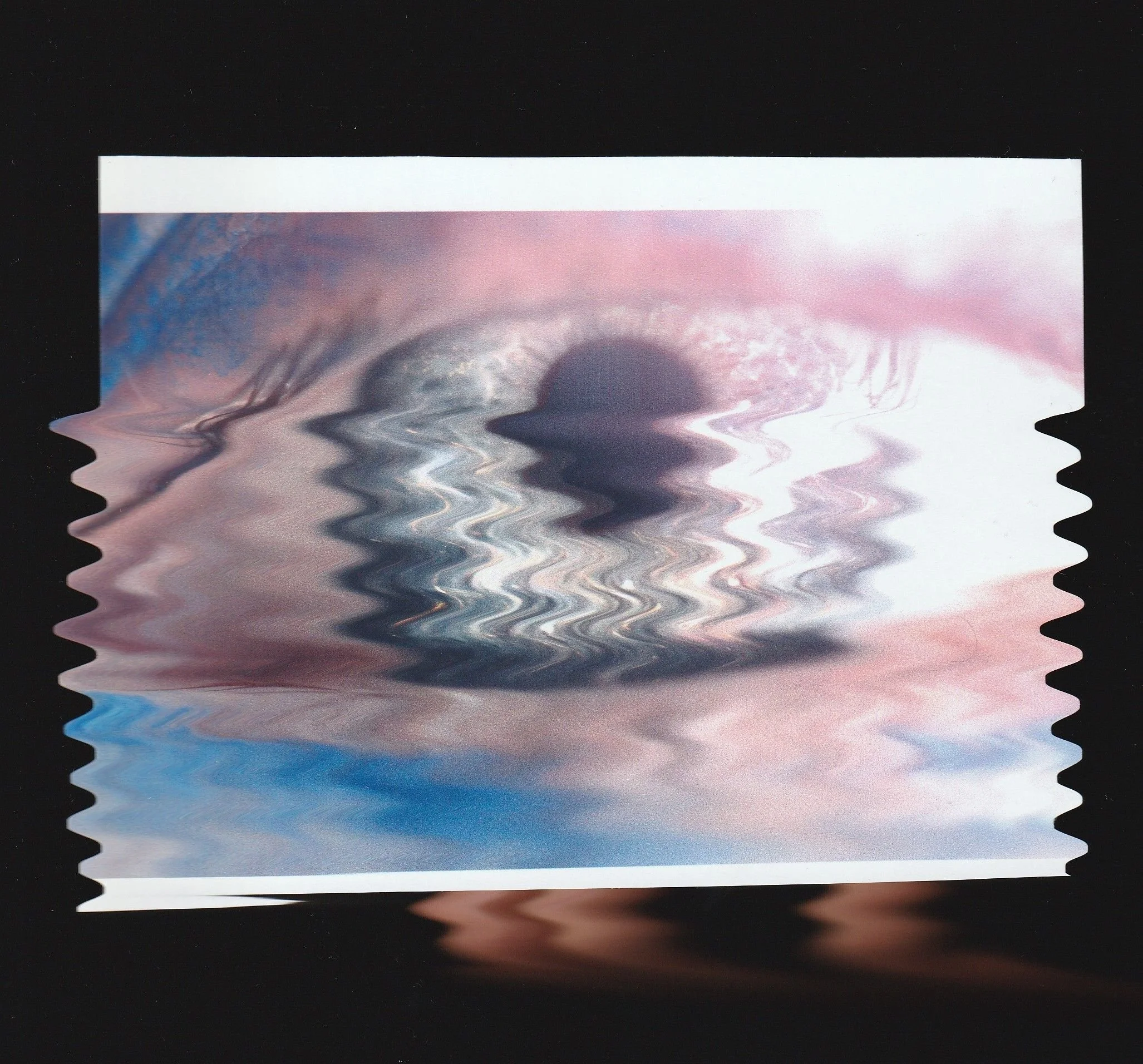
For my 3 multi-media artefacts, I chose to experiment with how colour is used/added to an image, with different methods for each outcome. This first result follows the theme of perception, focusing on the idea of visual and metaphysical clarity and how things are perceived.
To achieve my final result, I used Free Lens photography of an eye, allowing for a clear close-up image with light leak, and Audacity to create glitch artwork with distorted colours. I used the following link as my inspiration and tutorial for this glitch technique;
Processes
Free Lens Photography
Glitch Photography
Technologies
Canon EOS 650D + Canon EF 100mm 1:2.8 Macro Lens
Photoshop
Audacity
Behind-The-Scenes
I used Free Lens photography with a 100mm macro lens and a Canon camera to capture a close-up of an eye. I roughly used blue eyeliner around my eye to add additional colour and detail to the image before sitting in the sunlight for natural lighting. I held the macro lens in front of the camera but disconnected from each other, pointed towards my eye, with the camera display screen rotated out so I could see it while capturing images. After capturing many phtos, I chose an image with the iris in focus and light leak around the edges for a clear yet dazed effect.

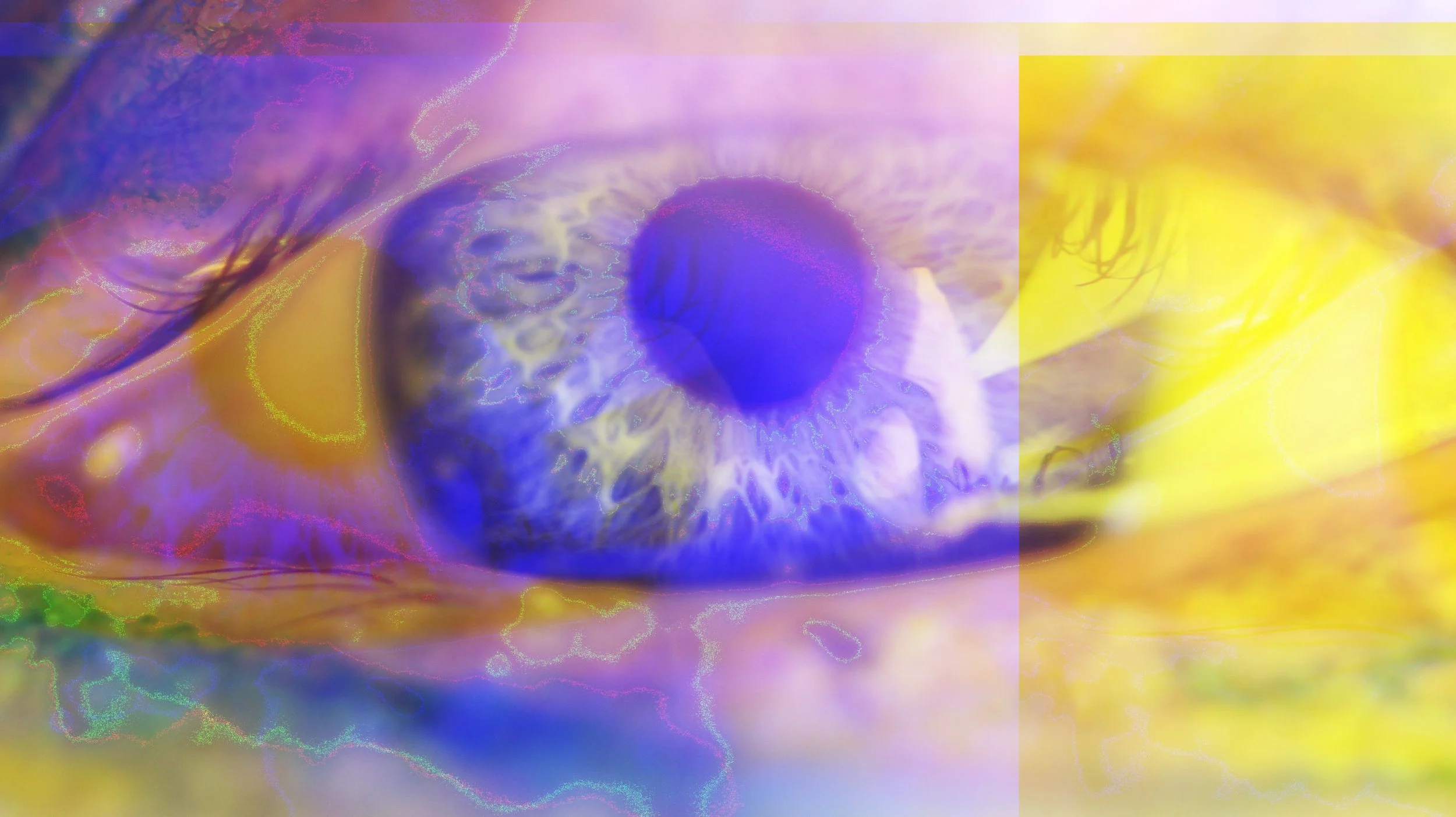
A few touch-ups were done in Photoshop to increase the contrast of this image before exporting it as a .tiff file separated by channels, making it compatible with Audacity (audio editing software). One imported as a raw data file, the image appears as an editable audio file. By editing the audio in various ways, it directly manipulates the image’s data, which can cause numerous glitch effects once converted back to an image file, allowing for much more raw, real, and unpredictable glitches than if you were to simply edit an image in Photoshop.


40+ effects can be added to any section of the audio file, each with customisable parameters. Sections can also be deleted, copied, and added, for endless possibilities overall, with very unpredictable outcomes that can’t be viewed until exported. I experimented with these effects until I had almost 100 glitched exports to choose from.
Examples


For the final outcome, I chose a glitch with interesting colour manipulation while still retaining the clarity of the pupil and overall shape of the eye to maintain the initial theme of this piece.
Outcome
Connection
For this artefact, I was inspired by Crisco Art on Instagram, who pushes holes into his canvases to combine string into his art. I got the idea for the focus of my photography from a photograph from Pinterest below, which used red string to symbolise the theory of invisible red string connecting lovers. I wanted to use this as inspiration while branching away from the topic of romance, and focusing on the idea of general connection instead, sewing a different colour of thread into an image of hands, with most of the colour in the image coming from the thread and other decorations put onto the image rather than the initial photograph itself.

Processes
Photography (High ISO)
Paper Sewing +Dried Flowers
Photoshop (Layer Masking)
Technologies
Canon EOS 650D + Canon EF 18-55mm Lens
Photoshop
Canon TS3350 Printer
Needle, Thread & Flowers
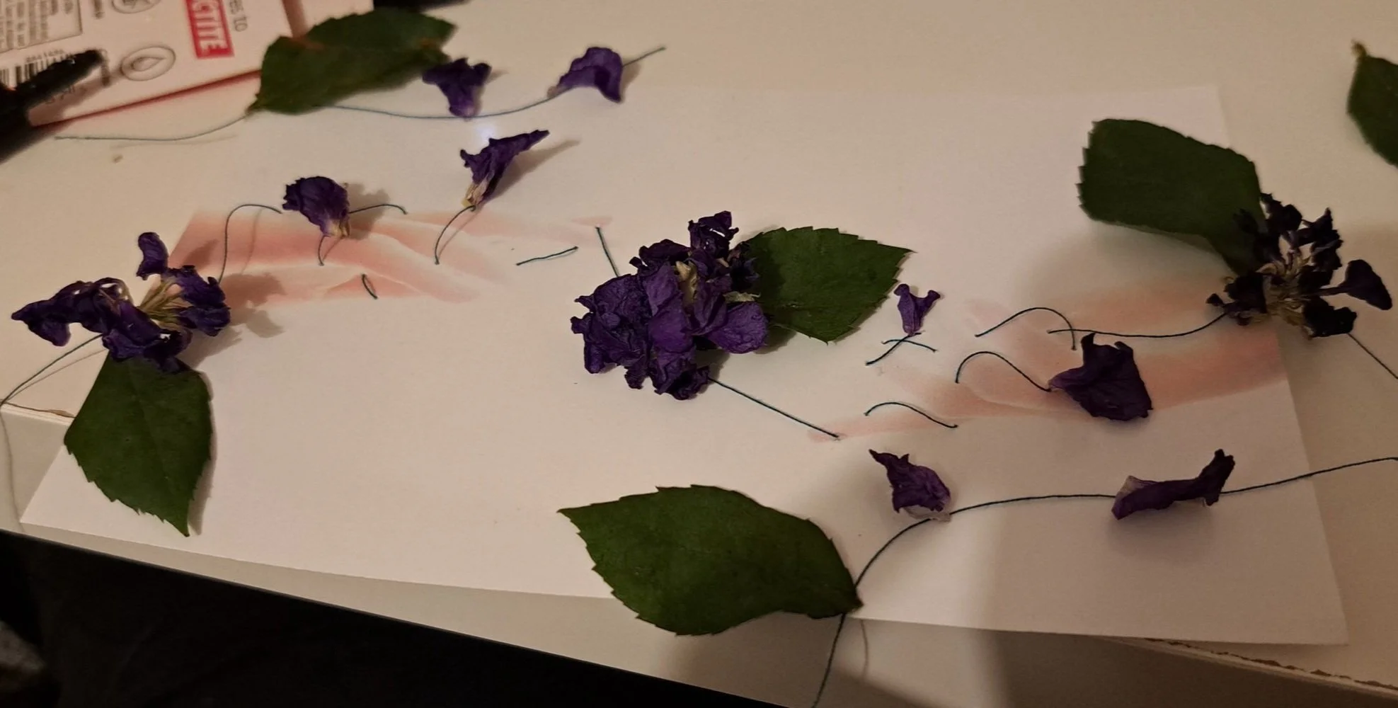
Behind-The-Scenes
To get the photos of the hands for this project, I pointed my camera at a bright light source and set the ISO very high, allowing for a pure white background and backlight to the hand in focus. I positioned my hand to 1 side to leave a gap between the hands when 2 of the images overlap with each other. 2 images were then chosen and layered with the above image set to the Darken blending mode to create the appearance of 2 hands in the same image.


I printed this image and poked holes into it with a needle before threading green thread through the holes. The green thread alone was too plain, so I added dried flowers and leaves as if they were growing from the thread, flourishing from the connection between the hands. I scanned this back onto my computer and used Photoshop masking to remove the background so the leaves, flowers, and thread could be added to the original high-quality image rather than the reduced printed image.

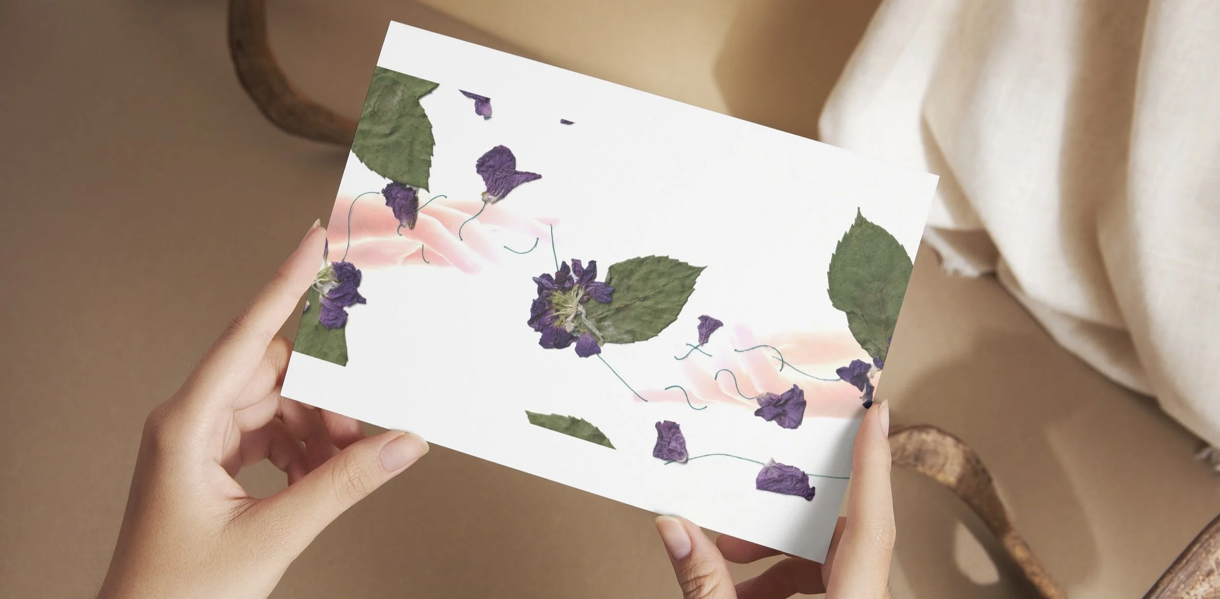
Outcome

Canva Mock Ups
Canva’s mockup feature allows you to test out images on different products to view the suitability of these designs. My final outcome fitted landscape greetings cards best, due to the image’s theme of connection and relationships of any kind. However, the simplicity of the design does fit landscape cushions too.

Femininity
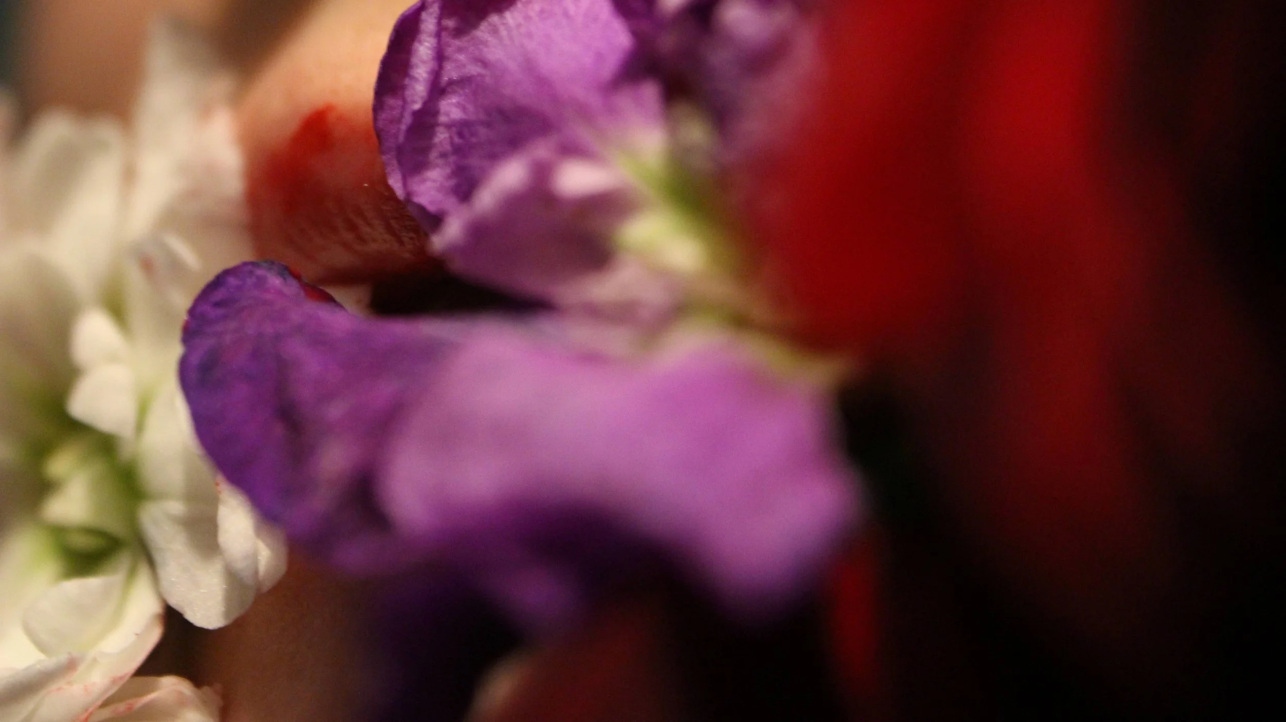
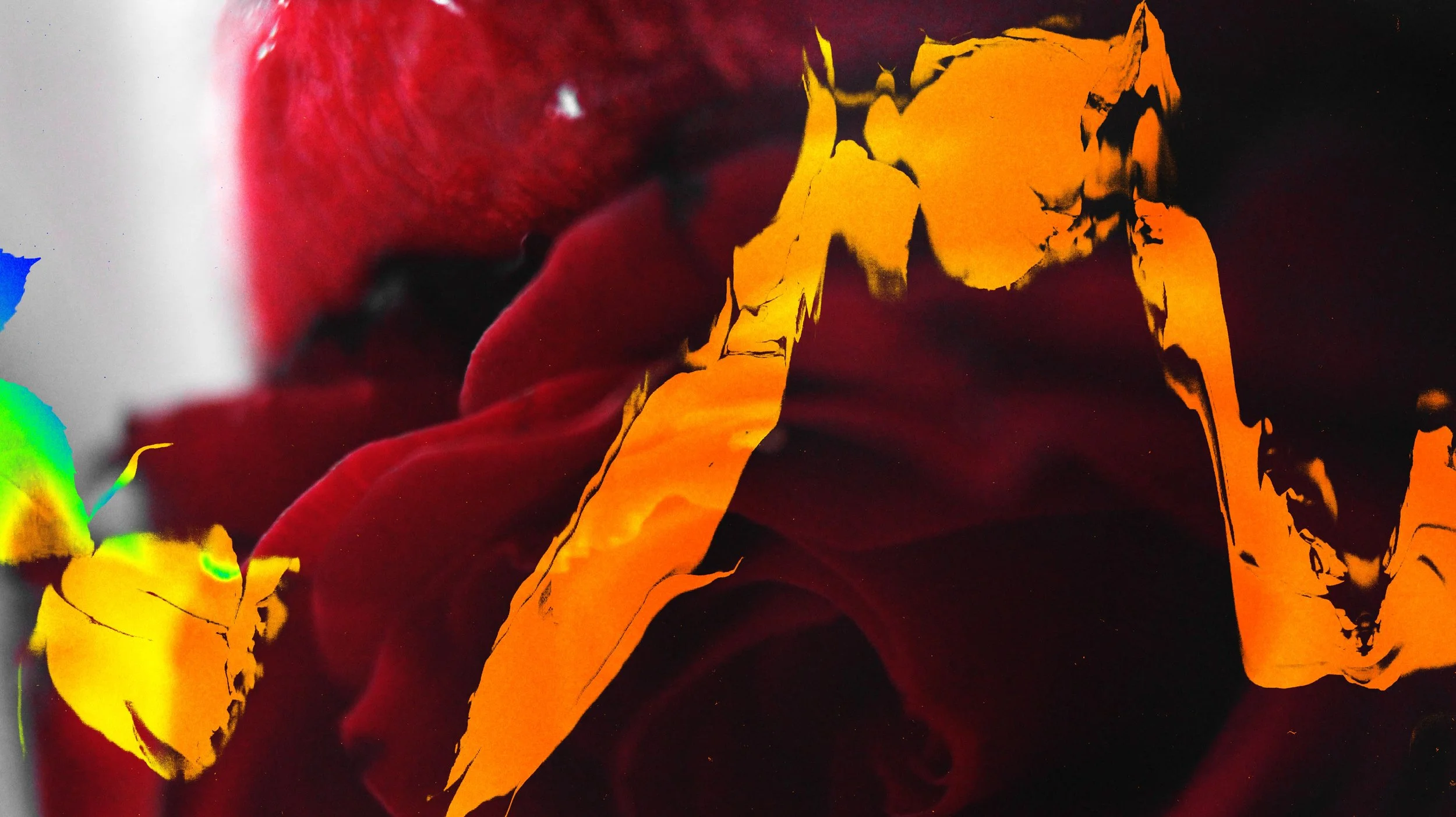
My final artefact focuses on femininity and predominantly uses the colour red and roses to symbolise this. From early on in the experimentation process, I envisioned a photograph of a red rose in someone’s mouth, with the red petals against red lipstick, taking the rose out of the common romantic connotations and creating bold visuals. The Pinterest post below helped further this idea, inspiring me to remove all other colours from the initial photo other than the red. Posts from @Jenrbacon on Instagram also encouraged me to experiment with flower scanography, using scanner art of flowers in some way in my final design.

Processes
Photography
Scanography
Photoshop (Adjustments & Masking)
Technologies
Canon EOS 650D + Canon EF 18-55mm Lens
Canon TS3350 Scanner
Photoshop
Behind-The-Scenes
I used a small aperture to capture close-ups of flowers against red lips with a shallow depth of field. I experimented with different flowers before deciding that my original plan of using a rose suited the bold representation of femininity that I was going for best. I then desaturated all colours other than red in the image using Photoshop to remove all other hues.


Using the flowers from my inital photography, created scanner art with the photo scanner of a Canon TS3350 Printer. This created distorted images of the flowers with an extremely low depth of field and dark backdrop. I experimented with various ways to combine these scans into my inital photography for a long time, testing out collages, different blend modes, masking and saturation, before settling on a combination of these tools.

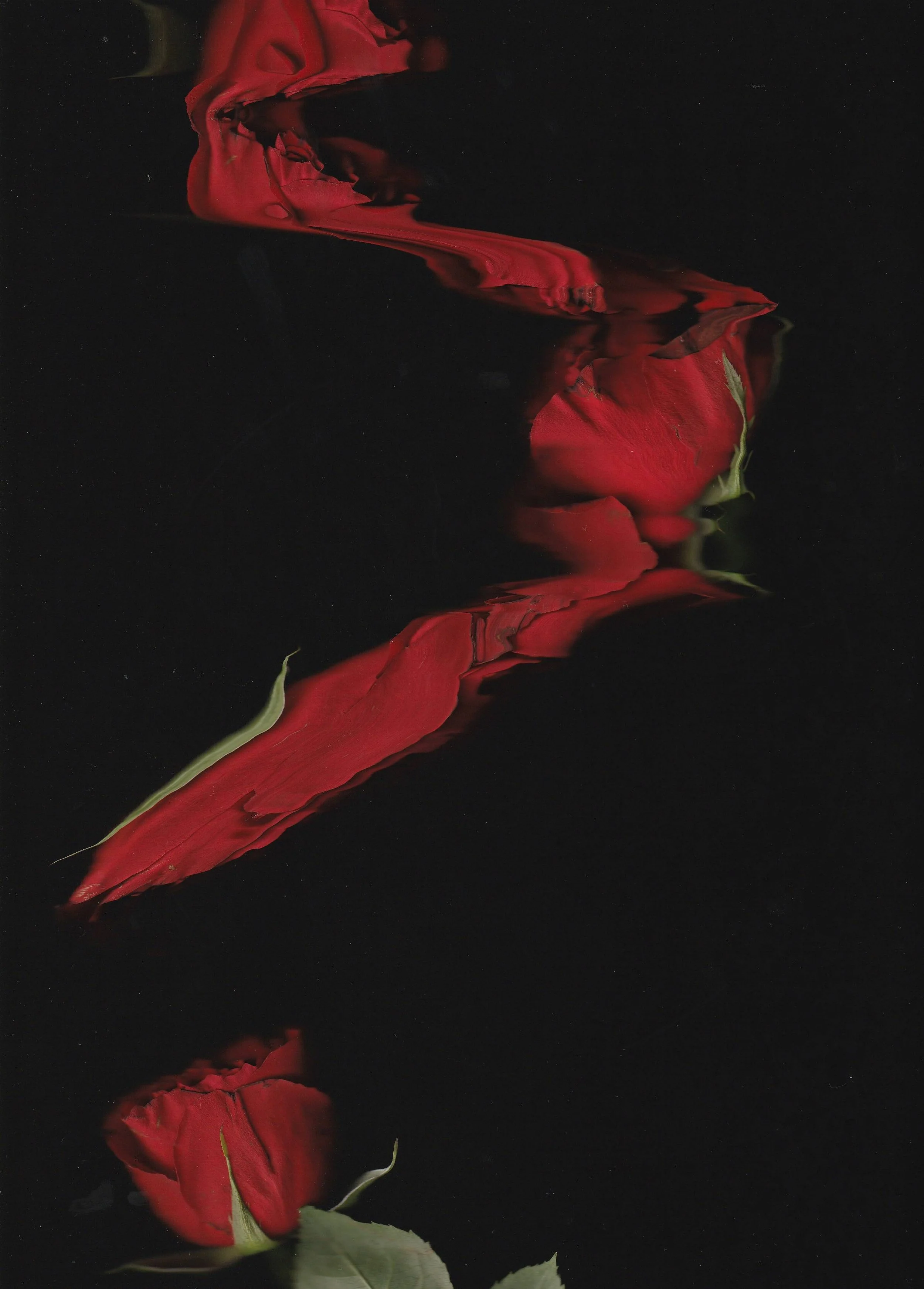

In order to achieve my final design, I selected the entire black colour range of a distorted scan of a single rose and inverted this selection to create a mask of only the coloured sections of the image. I then created a Gradient Map adjustment layer over my initial photograph with a rainbow gradient, and added the mask from the scanography to this layer. The result is the initial image of the rose and lips with a bright and partially rainbow colouration across the image in the distorted shape of a rose. I chose this adjustment rather than subtler or cleaner effects as I felt the messy and fiery look added a sense of rebellion to the image, further depicting the power of femininity and pushing against the delicate and pristine stereotypes associated with it.

Outcome
Canva Mock Ups
Using Canva’s Mock Up feature, I tested this image with numerous products before deciding it worked best with scented products such as candles and oils. This works best because rose imagery is often used with florally scented products, and feminine individuals often use self-care items more than masculine ones.


Other Experiments
Experiments with distoring the eye photograph using scanography; this caused issues with overall image quality due to printer limitations

A test of using red thread with the hands; I disliked the specifically romantic connotations of this
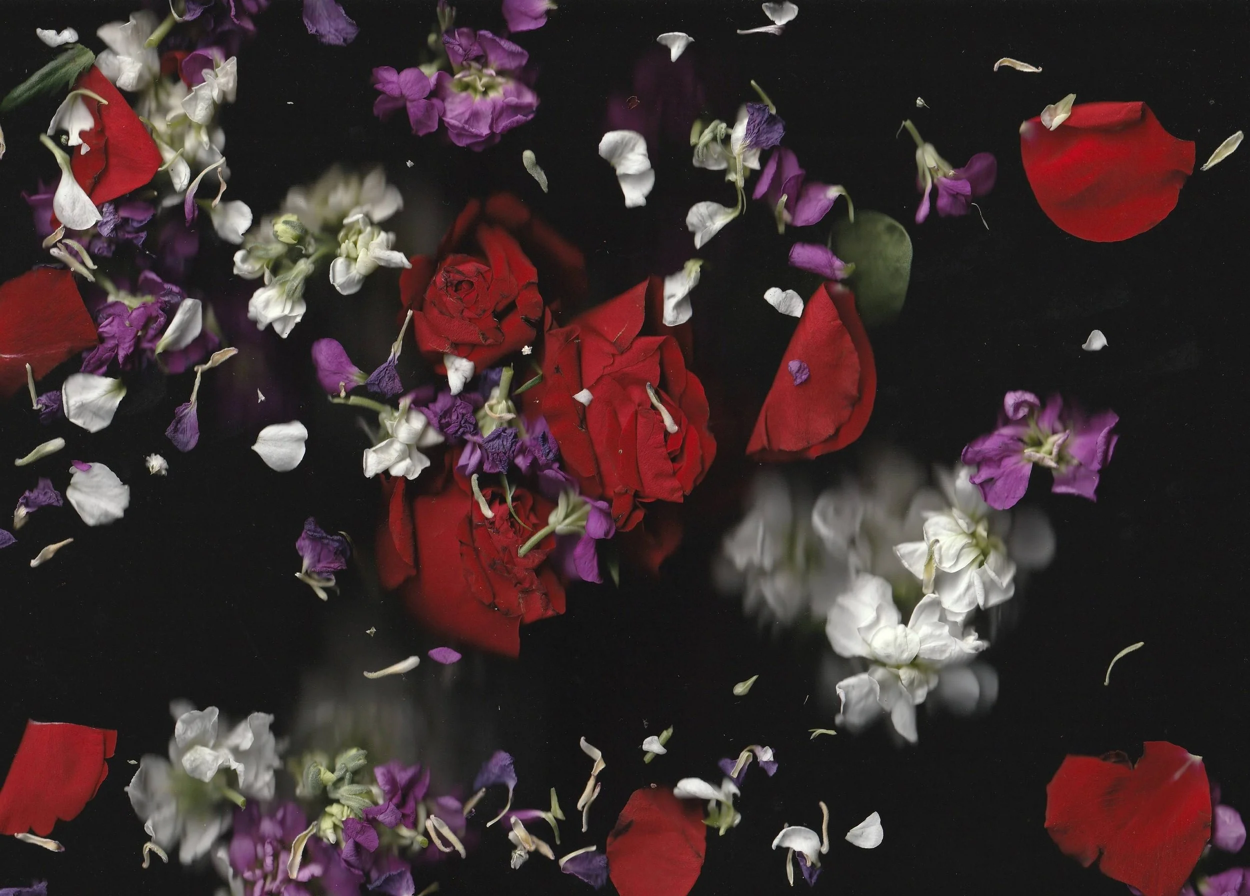
Further experiments creating scanner art with various flowers; I favoured simpler scans with the final result